Box plot

In descriptive statistics, a box plot or boxplot (also known as a box-and-whisker diagram or plot) is a convenient way of graphically depicting groups of numerical data through their five-number summaries: the smallest observation (sample minimum), lower quartile (Q1), median (Q2), upper quartile (Q3), and largest observation (sample maximum). A boxplot may also indicate which observations, if any, might be considered outliers.
Boxplots display differences between populations without making any assumptions of the underlying statistical distribution: they are non-parametric. The spacings between the different parts of the box help indicate the degree of dispersion (spread) and skewness in the data, and identify outliers. Boxplots can be drawn either horizontally or vertically.
Contents |
Alternative forms
Box and whisker plots are uniform in their use of the box: the bottom and top of the box are always the 25th and 75th percentile (the lower and upper quartiles, respectively), and the band near the middle of the box is always the 50th percentile (the median). But the ends of the whiskers can represent several possible alternative values, among them:
- the minimum and maximum of all the data[1]
- the lowest datum still within 1.5 IQR of the lower quartile, and the highest datum still within 1.5 IQR of the upper quartile
- one standard deviation above and below the mean of the data
- the 9th percentile and the 91st percentile
- the 2nd percentile and the 98th percentile.
Any data not included between the whiskers should be plotted as an outlier with a dot, small circle, or star, but occasionally this is not done.
Some box plots include an additional dot or a cross is plotted inside of the box, to represent the mean of the data in addition to the median.
On some box plots a crosshatch is placed on each whisker, before the end of the whisker.
Fairly rarely, box plots can be presented with no whiskers at all.
Because of this variability, it is appropriate to describe the convention being used for the whiskers and outliers in the caption for the plot.
The unusual percentiles 2%, 9%, 91%, 98% are sometimes used for whisker cross-hatches and whisker ends to show the seven-number summary. If the data are normally distributed the locations of the seven marks on the box plot will be equally spaced.
Visualization
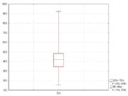
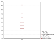
The boxplot is a quick way of examining one or more sets of data graphically. Boxplots may seem more primitive than a histogram or kernel density estimate but they do have some advantages. They take up less space and are therefore particularly useful for comparing distributions between several groups or sets of data (see Figure 1 for an example). Choice of number and width of bins techniques can heavily influence the appearance of a histogram, and choice of bandwidth can heavily influence the appearance of a kernel density estimate.
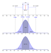
As looking at a statistical distribution is more intuitive than looking at a boxplot, comparing the boxplot against the probability density function (theoretical histogram) for a normal N(0,1σ2) distribution may be a useful tool for understanding the boxplot (Figure 2).
See also
- Exploratory data analysis
- Five-number summary
- Seven-number summary
Notes
- ↑ Robert McGill, John W. Tukey, Wayne A. Larsen (February 1978). "Variations of Box Plots". The American Statistician 32 (1): 12–16. http://lis.epfl.ch/~markus/References/McGill78.pdf.
References
- John W. Tukey. "Exploratory Data Analysis". Addison-Wesley, Reading, MA. 1977.
- Robert Mcgill, John W. Tukey, Wayne A. Larsen. "Variations of Box Plots". The American Statistician, Vol. 32 (1), 1978. 12-16.
- Michael Frigge and David C. Hoaglin and Boris Iglewicz. "Some Implementations of the Boxplot". The American Statistician. Vol. 43 (1), February 1989. 50–54.
- Yoav Benjamini. "Opening the Box of a Boxplot". The American Statistician. Vol 42 (4), November 1988. 257–262.
- Peter J. Rousseeuw, Ida Ruts and John W. Tukey. "The Bagplot: A Bivariate Boxplot". The American Statistician. Vol 53 (4), November 1999. 382–387.
External links
- Visual Presentation of Data by Means of Box Plots (PDF)
- On-line box plot calculator with explanations and examples
- Box and Whisker Plots in gnuplot
- Box and Whisker Diagrams: getting Microsoft Excel to plot them for you
- Box and Whisker Plots in Microsoft Excel
- Box plot and whisker plots in Excel 2007
- Box plot explanation, examples and a javascript/css-based box plot
|
|||||||||||||||||||||||||||||||||||||||||||||||||||||||||||||||||||||||||||||||||||||||||||||||||||||||||||||||||||||||||||||||||||||||||